Fixing STL Style’s Search Bar and Site Navigation
When we started working with STL Style, a well-loved custom print shop in St. Louis, one thing was clear: people loved the brand, but weren’t loving the experience of using the website. Products were hard to find. The navigation felt clunky. And the search bar? Basically ignored.
We believe great design is more than just how something looks—it’s about how it works. So we set out to rework STL Style’s search and navigation in a way that made the experience feel as seamless and local-proud as the products they sell.
It didn’t take long to pinpoint the pain points
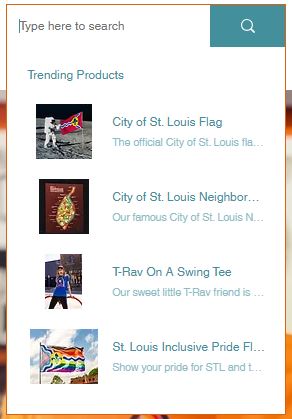
- People weren’t using the search bar. It was hard to see and returned weak results.
- Navigation felt overwhelming. Too many categories buried under dropdowns meant users were bouncing before ever seeing a product.
- Mobile users struggled. Menus were hard to tap, and it wasn’t always obvious where to go next.
On top of that, customers were reaching out directly to ask about items they knew existed but couldn’t find. That’s never a good sign.
First, we gave the search bar a proper makeover:
- More prominent placement on both desktop and mobile
- Auto-suggestions to help users find products faster
- Improved search logic, making it more forgiving of typos and better at ranking relevant results
- Placeholder text that responds, so users understood what they could search for (“Search tees, stickers, Categories…”)
We also made sure it played nice on mobile — because over 60% of STL Style’s traffic comes from phones.
Next, we tackled navigation. We wanted it to feel intuitive but still show off the depth of STL Style’s product line.
Here’s what we did:
- Simplified the main menu—less digging, more browsing
- Added a new featured item slider to the homepage to drive users directly to hot products
- Improved mobile navigation, with larger tap targets and a smoother slide-out menu
We basically made it easier for people to find what they didn’t even know they were looking for.
Post-launch, we saw immediate improvements:
- Search usage jumped by 300%
- Bounce rate dropped by 20% on key pages
- Time on site increased by nearly a minute
- Customers were spending less time searching—and more time adding things to their carts
This project reinforced something we see time and time again: small UX tweaks can lead to big wins.
- Don’t underestimate the search bar — people rely on it more than you think, especially when they’re ready to buy.
- Navigation doesn’t need to be fancy — it just needs to work.
- And on mobile? Every tap matters.
We loved working with STL Style because their mission — celebrating St. Louis pride — is one we deeply relate to. Helping them make their online store feel as awesome as their physical one was a no-brainer.
If your website is frustrating your users, we’d love to help you fix that. Sometimes all it takes is rethinking how people actually move through your site.